I’ve spent the last few days with my nose glued to my monitor, performing a much-needed update to my website. I’m now responsive – meaning my website should work on most mobile devices and tablets!
I know a bit of internet coding – and now that geekdom is cool, it’s my claim to geekdom! Lol… I’m self-taught from back in the day when html was just html. Nowadays it’s gotten so complex – it’s different KINDS of html, and you should let the browser know which you are using so it doesn’t get confused.
Which causes me to scratch my head and say wait, which kind am I using?
But I think I’ve succeeded – mostly! You can actually see what I did in this browser window. If you resize it to narrower the look will totally change. I had finished mostly with the layout last night, and was totally stoked and sharing my dorky stoked-ness with my husband.
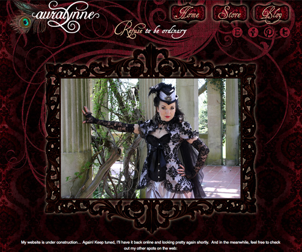
I show him the full layout, which looks like this on the homepage:
Then I drag the window in, resizing it so that the mobile layout will engage, and it pops into place like this:
And since the awesome layout poppage totally deserves a sound effect, I say “Boing!”
And I can’t resist dragging the window out and in several times, and say “Boing!” each time the layout changes from mobile to normal and back again.
My husband gives me a nonplussed look and says, “Wow, you are a dork.”
And I say, “Nuh-uh, I am the girl who makes the website that goes…”


